Cowboy
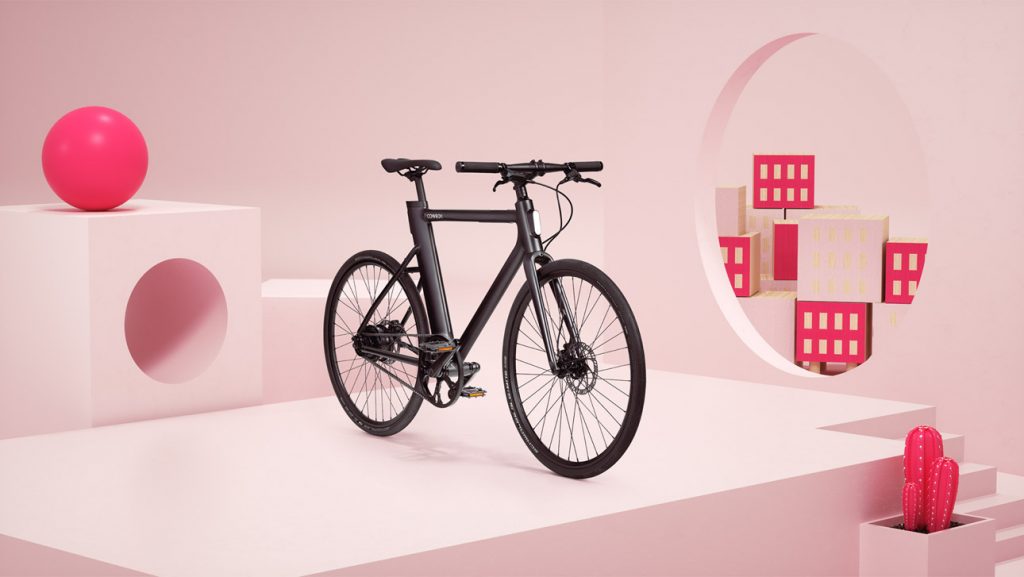
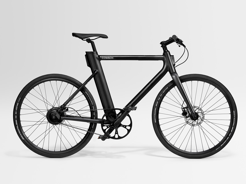
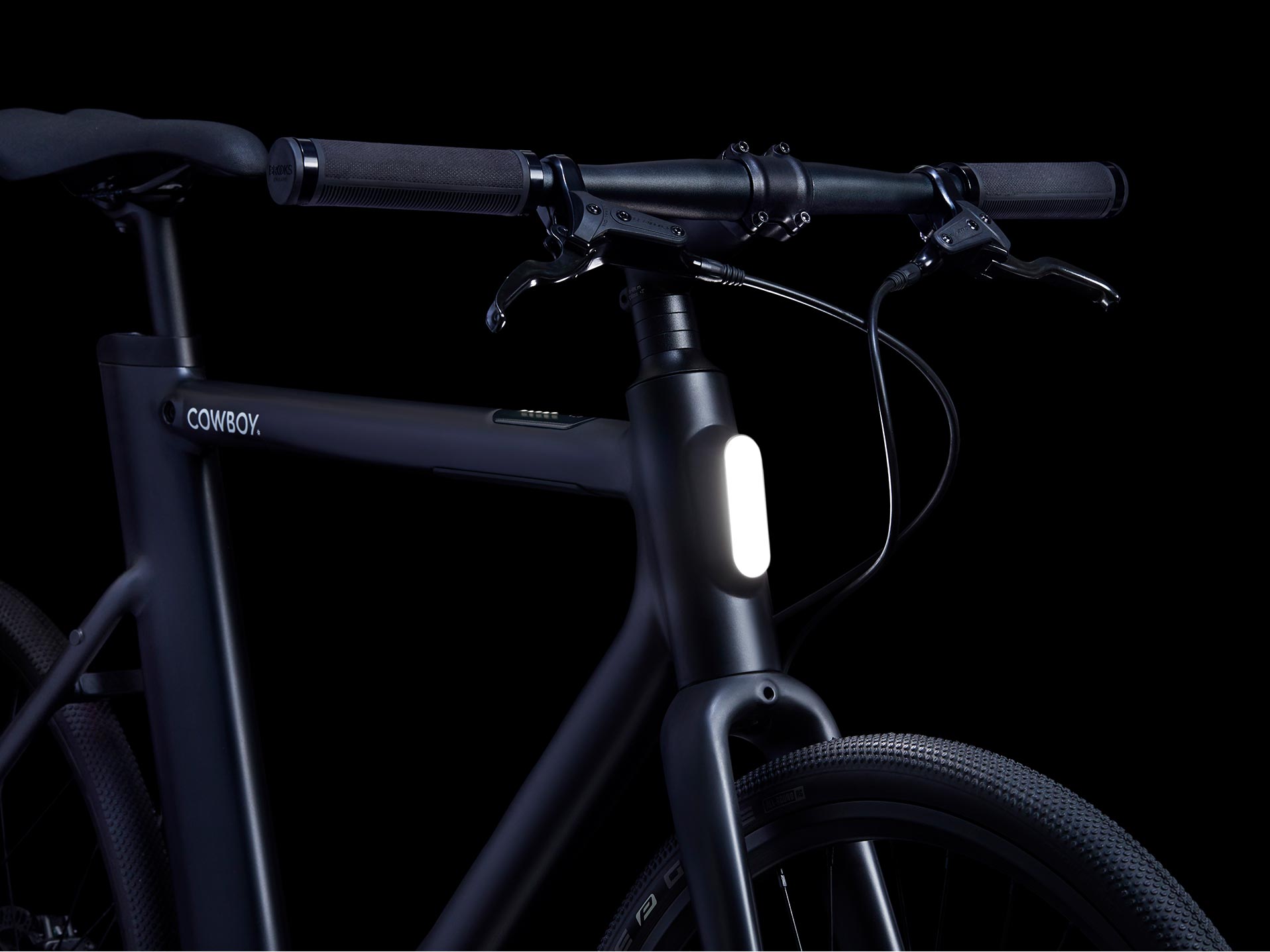
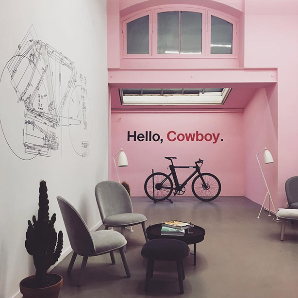
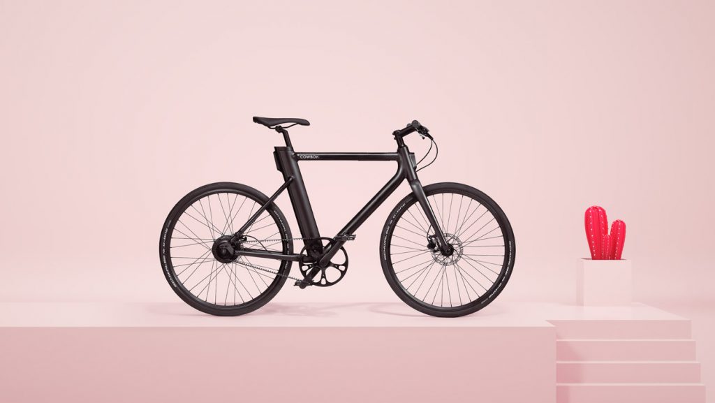
Cowboy is an electric bike startup founded by three friends with a background in software engineering. Based in Brussels, Belgium, the company’s first product is a beautiful motor-assisted bicycle designed to appeal to new buyers with a more beautiful design, a lower price, and better technology than the market is used to.
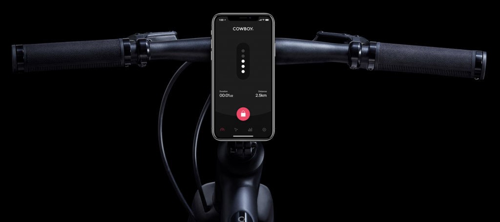
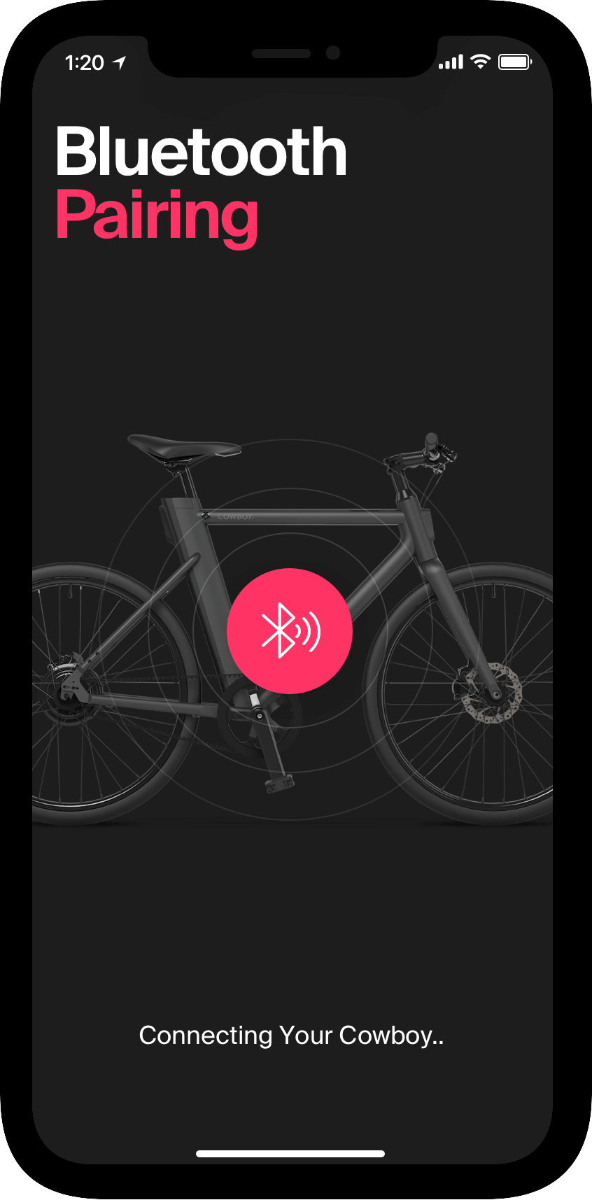
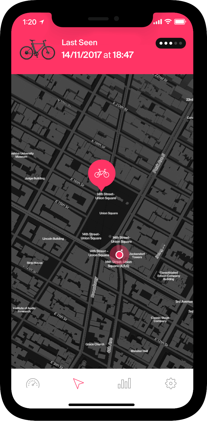
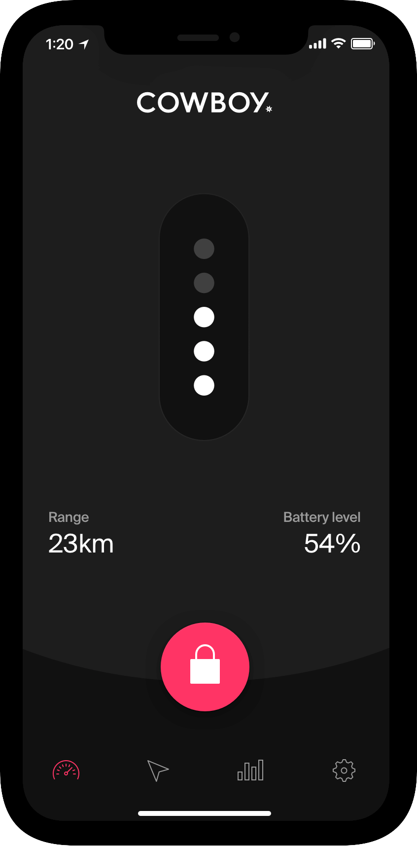
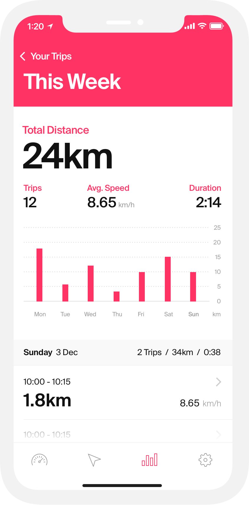
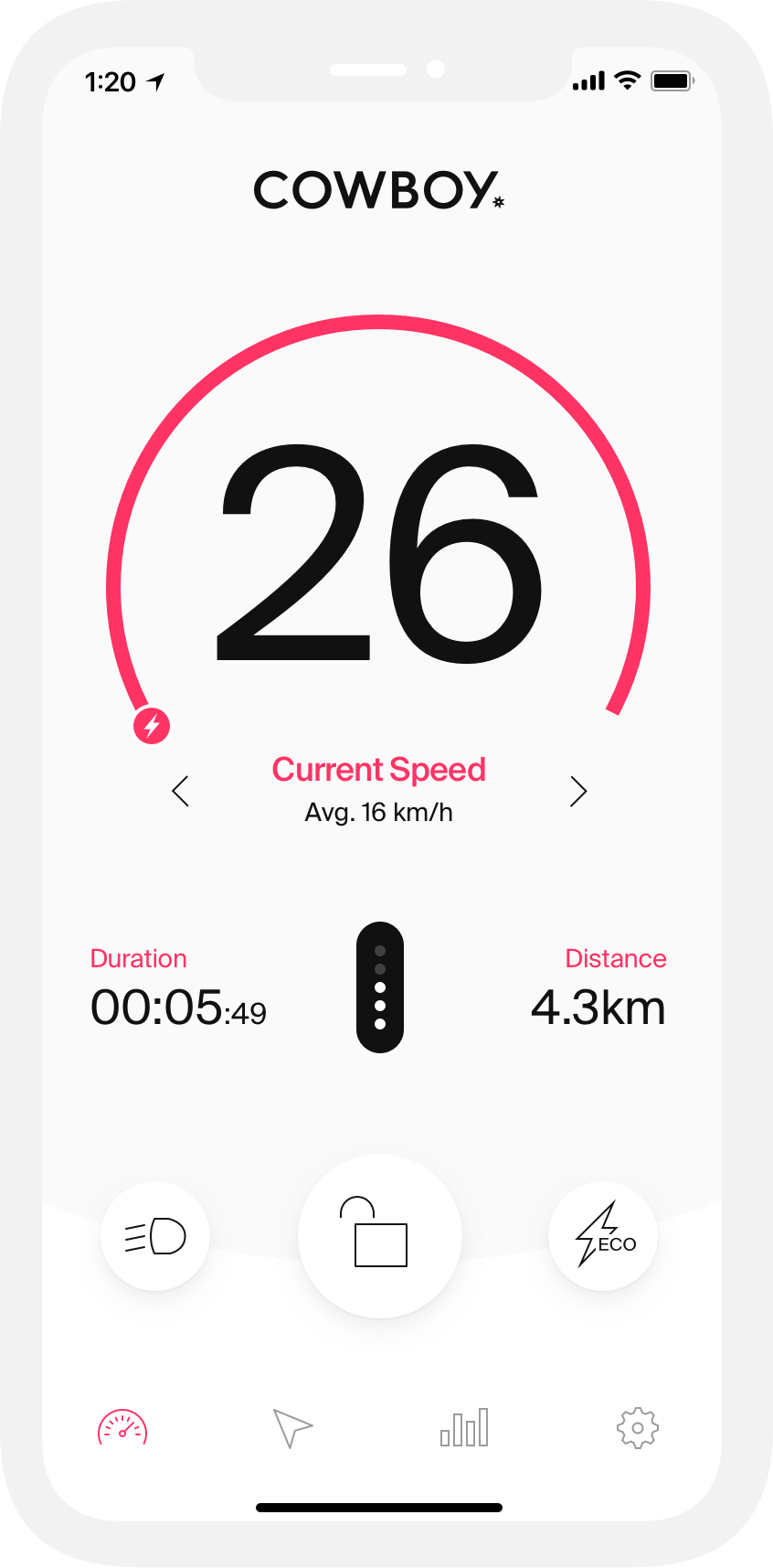
Barely out of the garage, the team from Cowboy came to Galactux with a name and a prototype. Over a period of several weeks, we worked closely with them on all aspects of the brand, a marketing and eCommerce website, and the app that’s a big part of the Cowboy user experience.
Growth spur
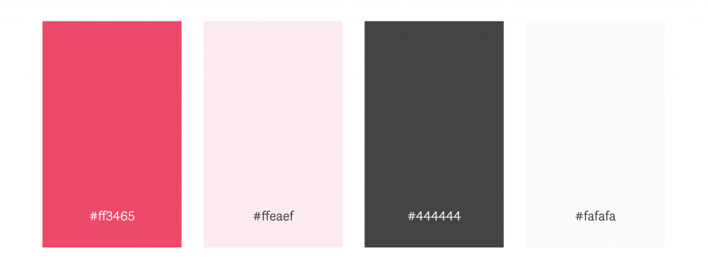
Logo and colors
“Cowboy” is a word that comes loaded with connotations. We purposefully avoided predictable Western references, but the logo gives a subtle nod to the spur, the small spiked wheel that riders use to urge their horses forward.
We put the fun in functionality
The joy of the brand
The Galactux design team took Cowboy to the streets and found it an unexpectedly joyful experience. We really wanted to capture that joy in the brand, making Cowboy less about features and functionality, and more about the emotions it provokes in riders.
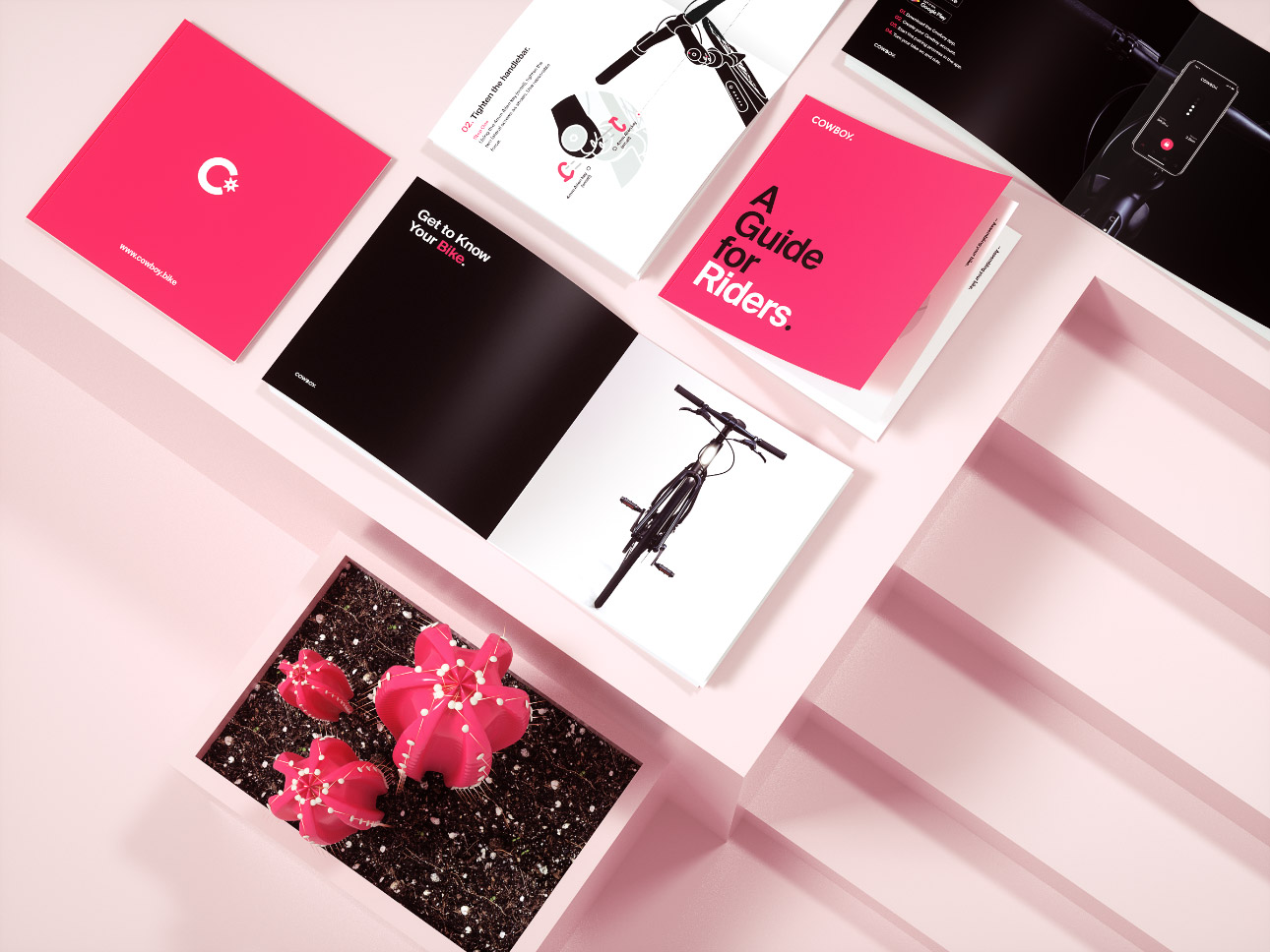
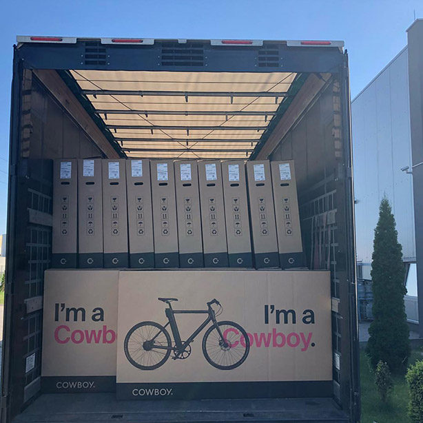
Digital is nice, but there’s something about the smell of ink. As Cowboy grows up, various printed materials start popping up. For example, there’s the Rider’s Guide, the product packaging, and various other marketing material.
Task
Electric bike startup Cowboy came to Galactux with a prototype and a name. We worked with them to develop a fully fleshed-out brand, ready to conquer the world.
